Connecting clients with their ideal luxury getaway, quicker.
As part of the in-house product team at The Thinking Traveller, a luxury villa rental operator - I led the redesign of the site’s search and discovery experience - driven by a clear need to make property & amenity locations easier to understand.
One of the ways this issue was addressed was with the introduction of interactive map view - giving users a more intuitive, confident way to explore and book the right property for their needs.
- 20
- reduction in task time for converting customers
Improved UX on the product grid page was credited with a significant reduction to the time it takes for a user to select a property.
- 12
- increase in AOV among returning customers
Search improvements drove deeper exploration of familiar regions among returning customers.
- 35
- decrease in avoidable calls to sales staff
UX improvements on the product page resulted in more queries being answered upfront.
Lost in the right place
Though the brand’s regional expertise was one of its core strengths, it inadvertently introduced friction for first-time visitors and those unfamiliar with the areas in which the company operated. Throughout key touchpoints in the search and discovery flow, properties were labelled using hyper-local place names which, while geographically accurate, often lacked the broader context visitors needed to make confident, informed decisions.
As a result, many prospective customers felt compelled to call a member of the sales team for clarification—placing additional strain on internal resources and exposing a broader weakness in the digital experience. While the company continues to take pride in its meticulously trained sales staff, I believed the website should offer the same clarity and contextual understanding, empowering users to complete a booking—whether online or over the phone—on their own terms.
Finding space for the bigger picture
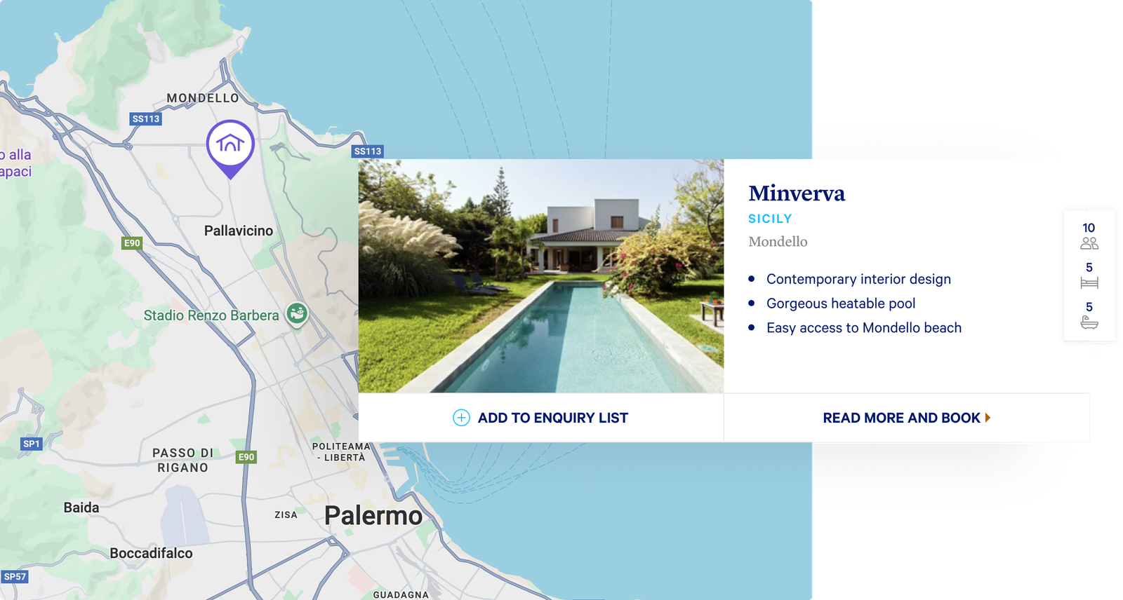
With the problem clearly surfaced, a steering committee aligned on the solution: introduce a map interface which would sit adjacent to the property cards to provide the crucial context they lacked - helping visitors understand where each property resides relative to local amenities without leaving the site.
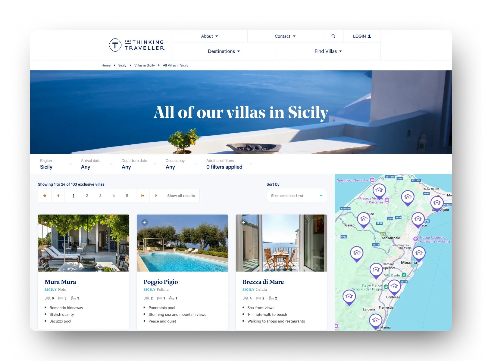
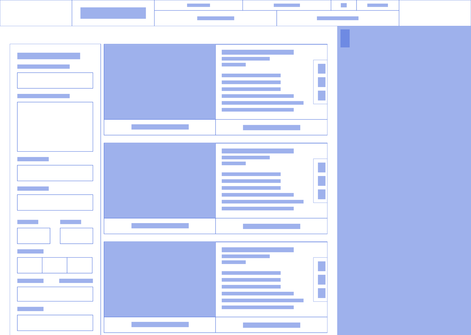
To support this ambition, we first needed to rework the product grid. The existing layout was inefficient, with oversized, verbose cards arranged in a single column; compounded by the filter criteria shown permanently on the side, this left little room for visual clarity, and even less for the map.
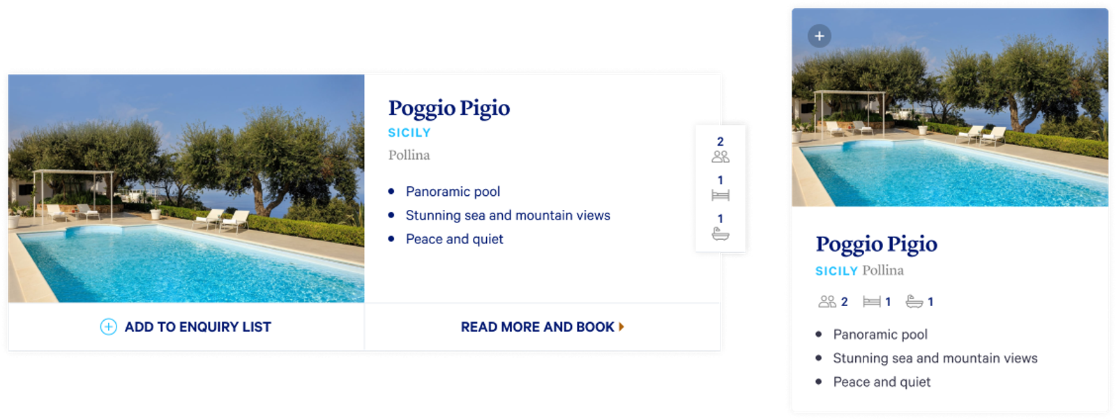
The product cards were redesigned to better support a more structured grid and to reduce visual clutter without sacrificing content, while the filters were reworked to employ a more progressive disclosure approach: collapsible controls with persistent summaries, shown only when relevant.
Putting it on the map
To bring the interactive map to life, we began by transforming the existing property location data into a more flexible JSON format. This enabled us to integrate seamlessly with the Google Maps API, plotting each villa as a custom-styled pin designed to blend in with the brand's existing design language.
The interaction model was designed to reinforce clarity and engagement. Clicking a map pin would scroll its matching product card into view, subtly highlighting it with a soft glow to draw the user's eye and distinguish it within the grid. Hovering over a card, in turn, would highlight its corresponding pin. This intrinsic pairing helped bridge the gap between structured produc information, and the spatial awareness that many users were seeking.
We also made the map function as a dynamic filter; after early internal testing revealed confusion when the grid showed results beyond those plotted in the visible map area, we updated the logic so that only properties within the current map view would be reflected in the adjacent product grid. This subtle change made zooming/panning the map not just an exploratory gesture, but a functional one.
Rolling it out
The new design was initially rolled out to 20% of users as part of an A/B test, giving us space to observe how real visitors responded to the new experience.
Early signs were encouraging. We noticed that converting customers - on average - spent *less* time on the grid page, suggesting that they were finding suitable properties more efficiently. Returning users bucked that trend slightly: spending a similar (or slightly longer) time on the grid page, but were booking more high-value stays.
Crucially, the most noticeable impact was a sharp drop in 'trivial' calls to the sales team for the sole purpose of clarifying basic location information - freeing them up to focus on qualified leads and sharing deeper local expertise.