
Macmillan Cancer Support
A modern redesign for the charity's biggest annual fundraising campaign.
During a short-term contract with Macmillan Cancer Support, I was tasked with redesigning the campaign page for their flagship event - World's Biggest Coffee Morning.
The goal: make browsing more enticing and each recipe easier to follow, so volunteers could spend less time searching and more time baking. The result was an engaging, inviting experience that put the fun of baking at the heart of the campaign.
Assembling the right ingredients
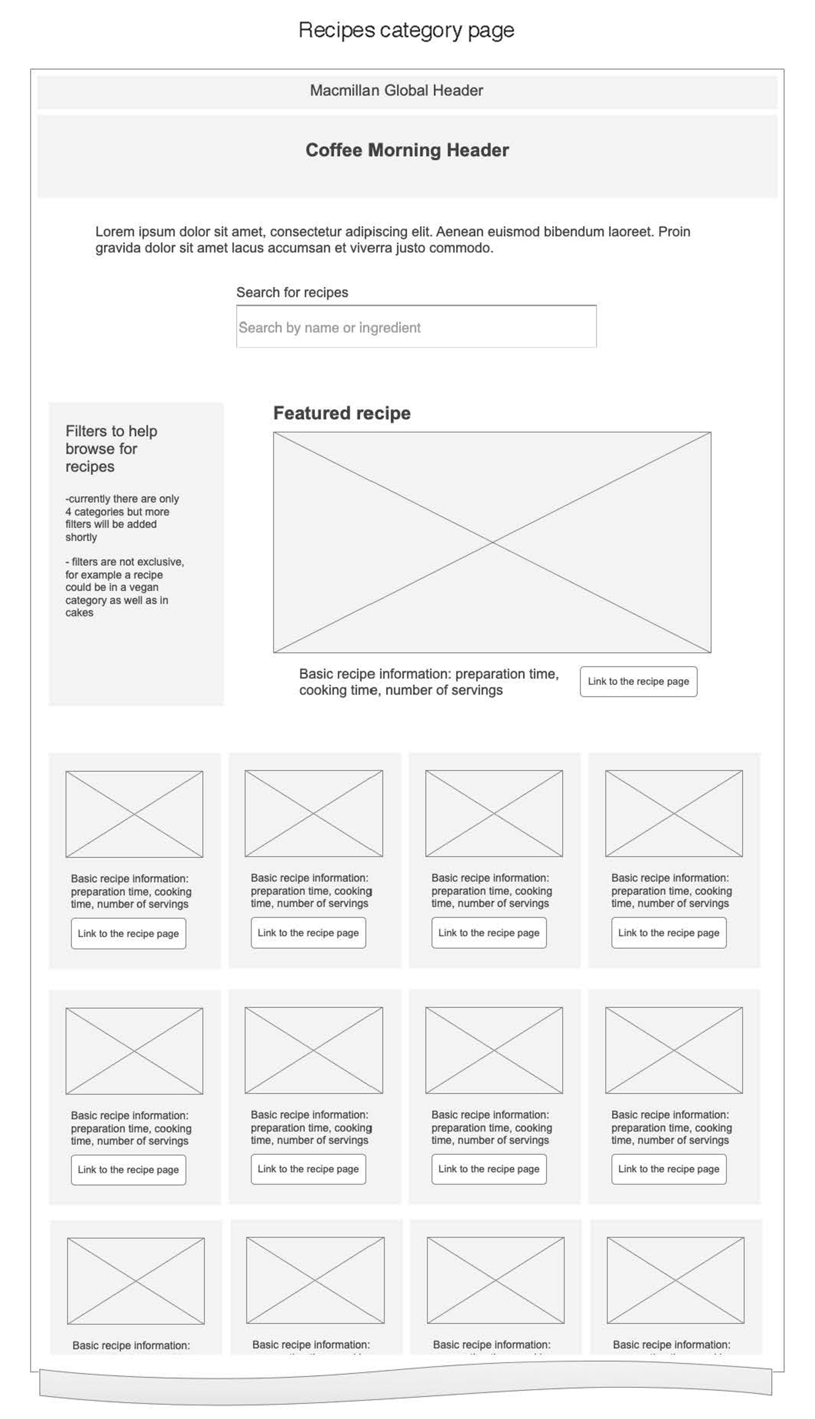
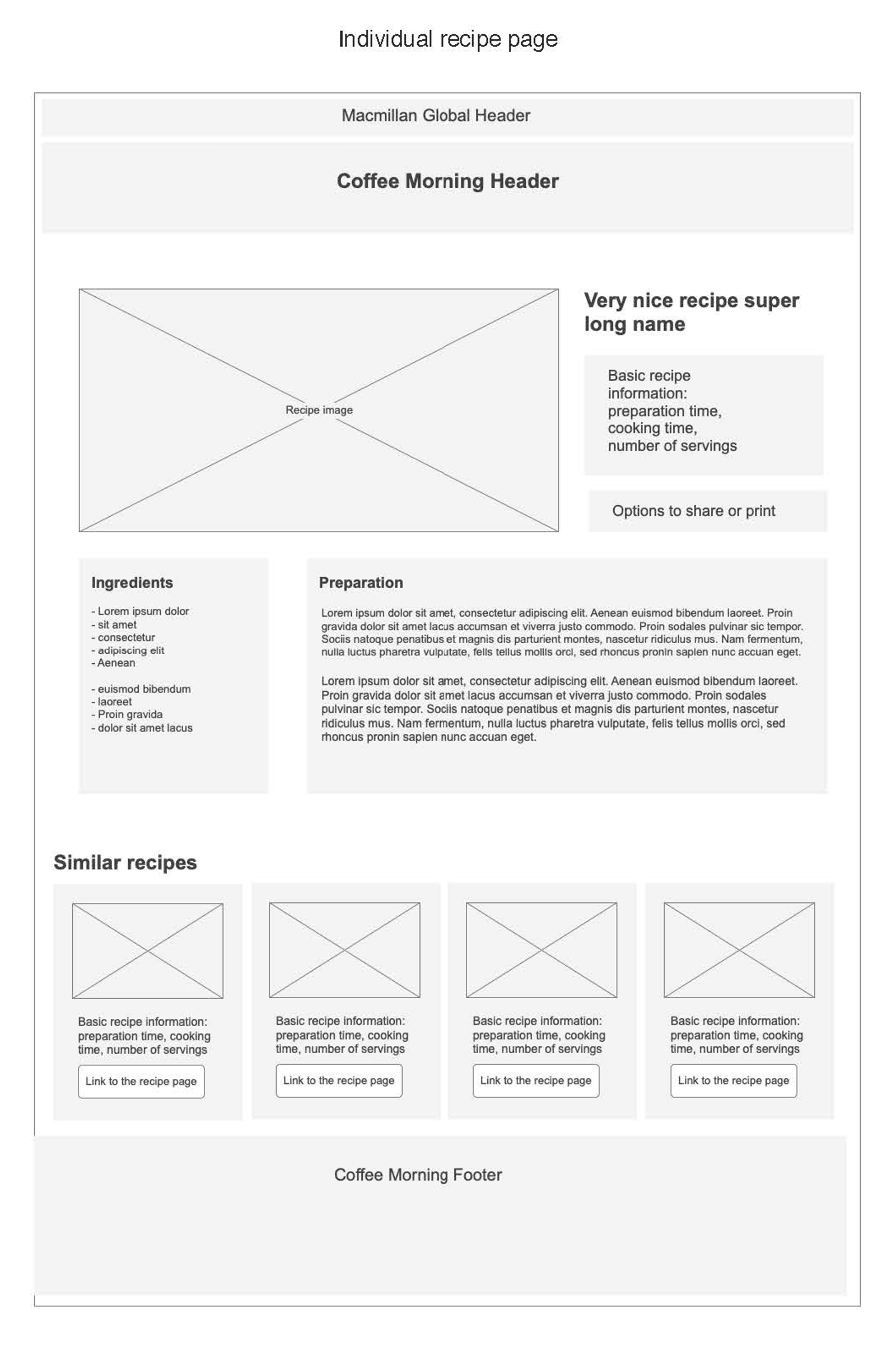
My initial wireframes for the recipe grid and detail pages helped clarify the essential features for a successful campaign.
On the grid page, it was clear that the search and filter options - by name, ingredient or other criteria - would be vital for helping participants quickly find the perfect recipe.
The the recipe detail page, the wireframes focused on clarity and usability: a well-organised list of ingredients and measurements, easy-to-follow preparation steps, and convenient sharing options. To encourage further discovery and help prevent potential drop-off, a list of similar recipes was also included before the footer.
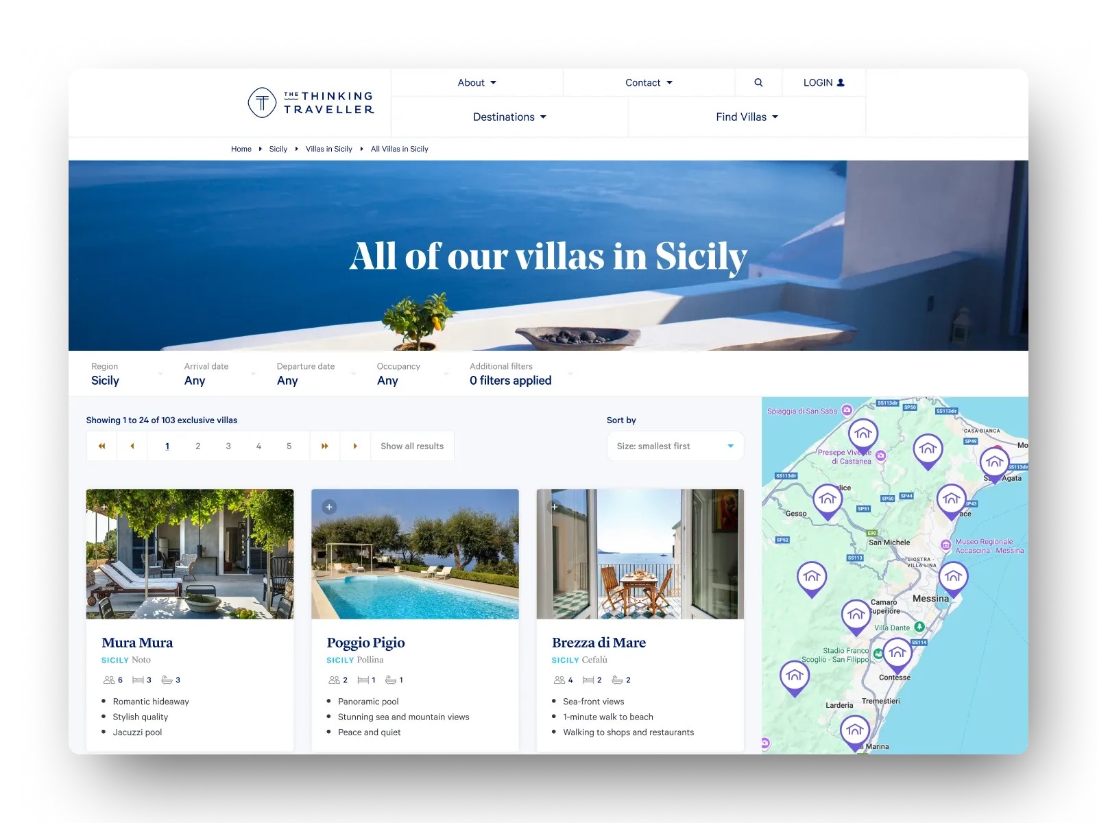
Scrolling through sweet possibilities
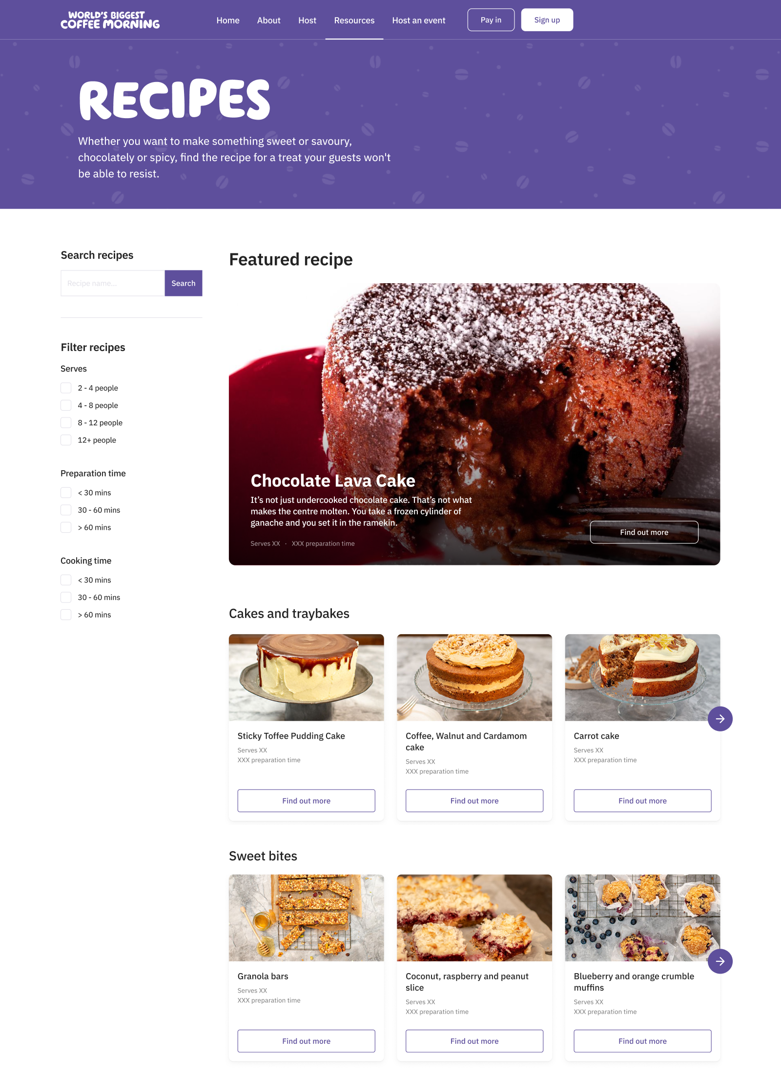
For the final version of the recipe grid page, I moved beyond a conventional grid layout, opting instead for a multi-row carousel made up of various categories & allowing users to scroll sideways in order to discover more recipes in each.
This approach offered the best of both worlds: an inviting 'all recipes' overview, cogently split by organised category headings for a more focused experience.
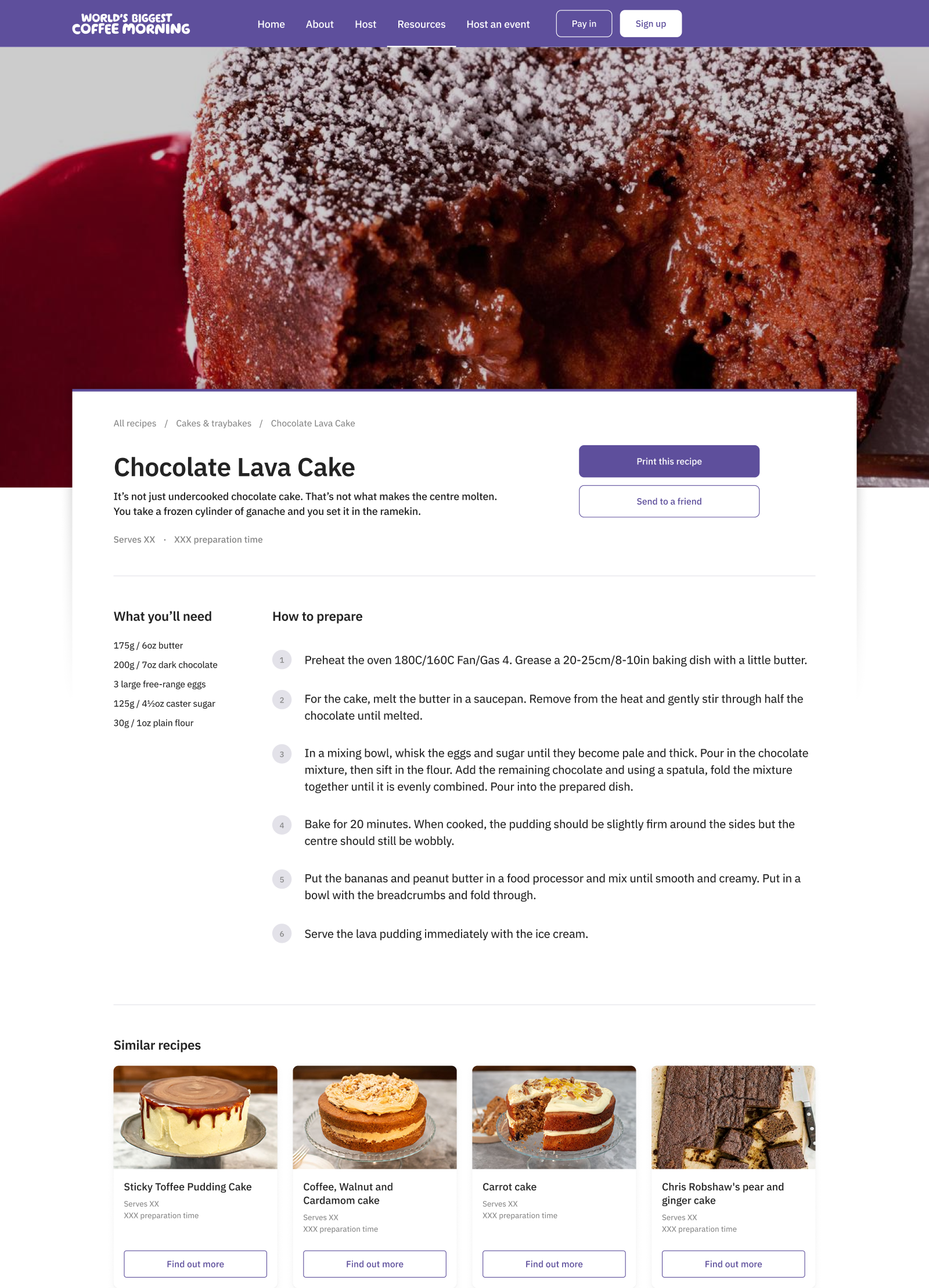
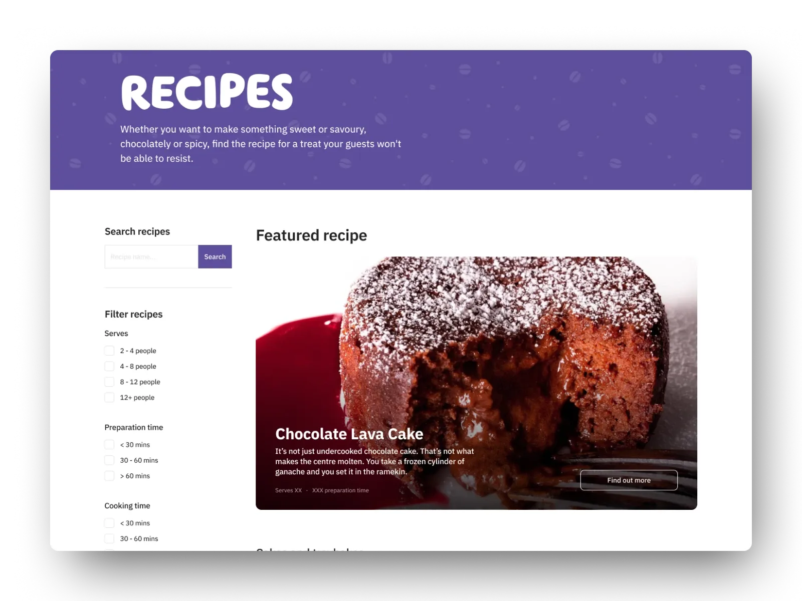
A layout that's easy to digest
The recipe detail page was designed to be visually striking yet functional; a bold, full-width image of the featured bake sets the scene, while the body content overlaps the image to create a modern, inviting look. Key actions such as sharing/printing are placed front and centre, making it effortless for participants to share recipes or simply to bring a printed copy into their kitchen.
For the recipe itself, ingredients and preparation steps are split into separate columns, with the latter also being presented as a clear, numbered list - making each stage of the recipe easy to follow and reducing the chance of mistakes.