Communicating the value of true full fibre broadband.
CityFibre is a leading provider of full fibre broadband infrastructure, empowering various UK network operators to deliver high-speed connectivity to homes and businesses.
During a six-month engagement with agency Dawson Andrews, I was tasked with designing & developing their marketing site to elevate the brand within a crowded market and effectively articulate the benefits of full fibre technology.
Not all fibre is created equal
Though it has increased in popularity & availability by today's standards, the notion of 'full fibre' in 2022 was relatively unheard of. Most consumer-grade broadband packages marketed as 'fibre' broadband at the time would often only utilise fibre optic cables to carry data from the exchange to the street cabinet - with the final stretch relying on decades-old copper wiring, creating a bottleneck and significantly limiting the speed & reliability of the connection for the customer.
True full fibre, on the other hand, utilises advanced fibre optic cables across the complete connection, from the exchange, all the way to the customer's premises. The key challenge faced in distinguishing CityFibre's offering from other 'part-fibre' solutions lay in effectively communicating this difference - and resulting benefits - to customers with varying degrees of technical knowledge.
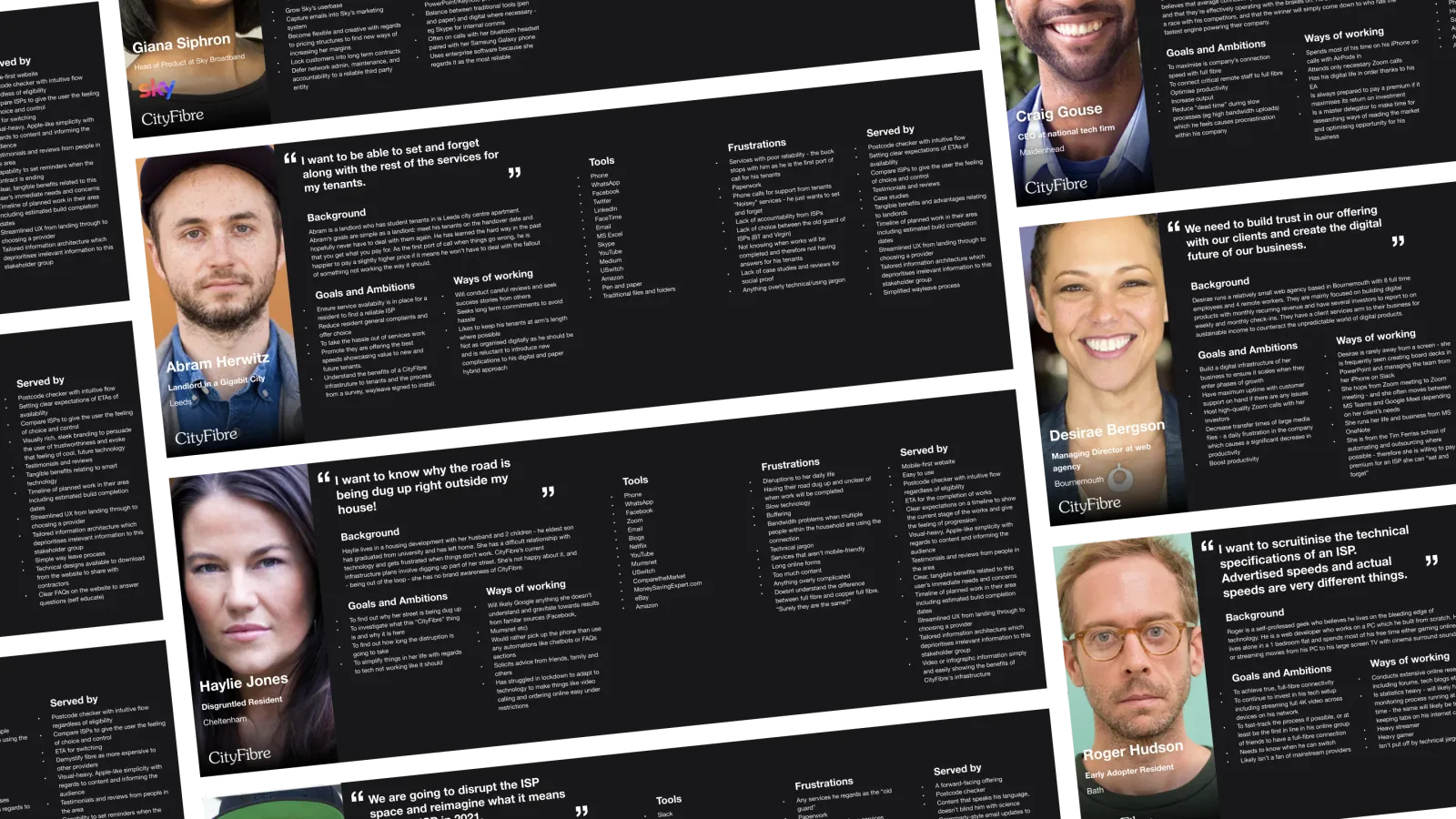
Designing for everyone
At the outset of the project, we developed a diverse set of user personas to guide our design decisions. These personas represented a broad spectrum of socioeconomic backgrounds and varying levels of technical confidence, ensuring that any solutions would be approachable and relevant to all audiences.
Special attention was given to those with limited understanding of technology, highlighting the importance of using simple, non-exclusionary language throughout the experience.
By defining these archetypes early on in the process and referring back to them at each stage, we kept the user experience grounded in the real-world needs and perspectives of our diverse customer base.
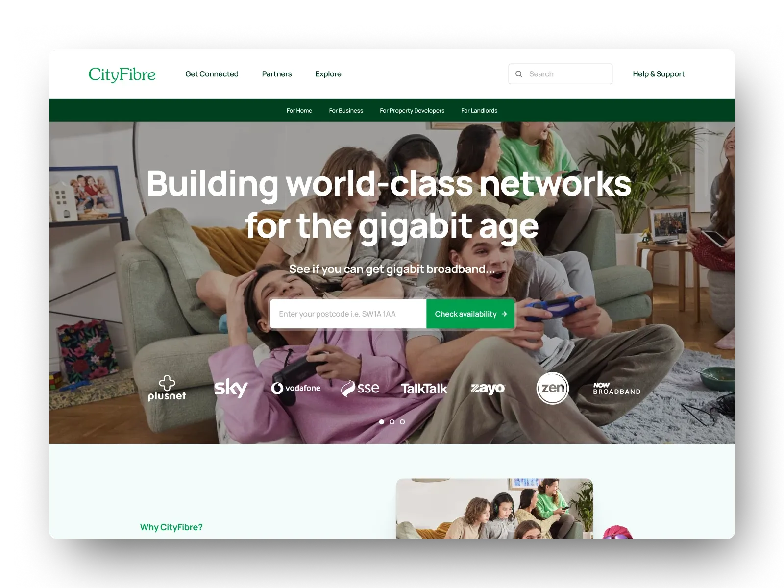
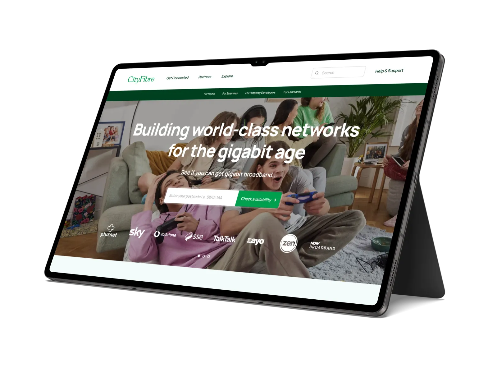
Checking availability, building anticipation
One standout feature of the site was the postcode availability checker, allowing prospective customers to quickly find out whether CityFibre services were currently available in their area - and if not, to register their interest that they might receive future updates.
The availability checker tool was particularly important owing to CityFibre still being in a relatively early growth phase with ambitions plans to scale nationwide. By capturing e-mail subscribers in areas not yet served, the company could build word-of-mouth awareness and keep potential customers engaged, ready to convert as soon as service became available.
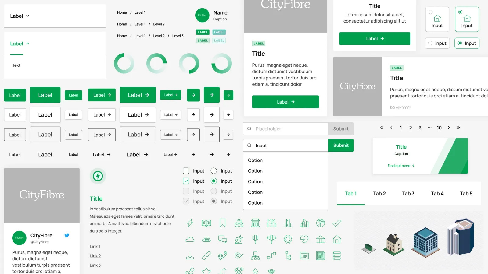
Consistency by design
With an expansive sitemap comprising hundreds of pages to build for the first delivery phases alone, establishing a robust design system was a priority from the outset. To ensure visual and functional consistency across every page, we created a dedicated Figma library housing reusable UI patterns, typography styles, key artwork, the brand colour palette and even guidelines around tone of voice.
This shared resource was configured to be available within all design files - whether spun up to explore early concepts or to handoff production-ready screens to developers - facilitating a 'define once, use everywhere' approach.
By maintaining a single source of truth for these vital patterns, we empowered multiple workstreams to stay aligned and deliver a cohesive user experience, regardless of project phase or contributor.