Building a unified design language for one of the UK's most prominent cultural organisations.
The British Council's digital estate had grown organically into a fragmented assortment of microsites — built on different technologies, managed by different teams, and each governed by different design standards. Beyond the maintenance overhead, the lack of brand cohesion undermined visitor confidence in the organisation's digital capabilities.
Partnering with the British Council on a 12-month contract, I led the creation of Brontë - a comprehensive design system and its counterpart React.js component library. With a system-wide approach to theming, accessibility, and compatibility with a headless CMS, it laid the foundation for a more streamlined and engaging digital estate.
- 30
- components delivered during tenure
During my 12-month engagement, I delivered 31 components addressing critical business needs.
- 7
- years in active use
The system - launched in 2019 - continues to remain in use across the British Council's digital estate.
A patchwork problem
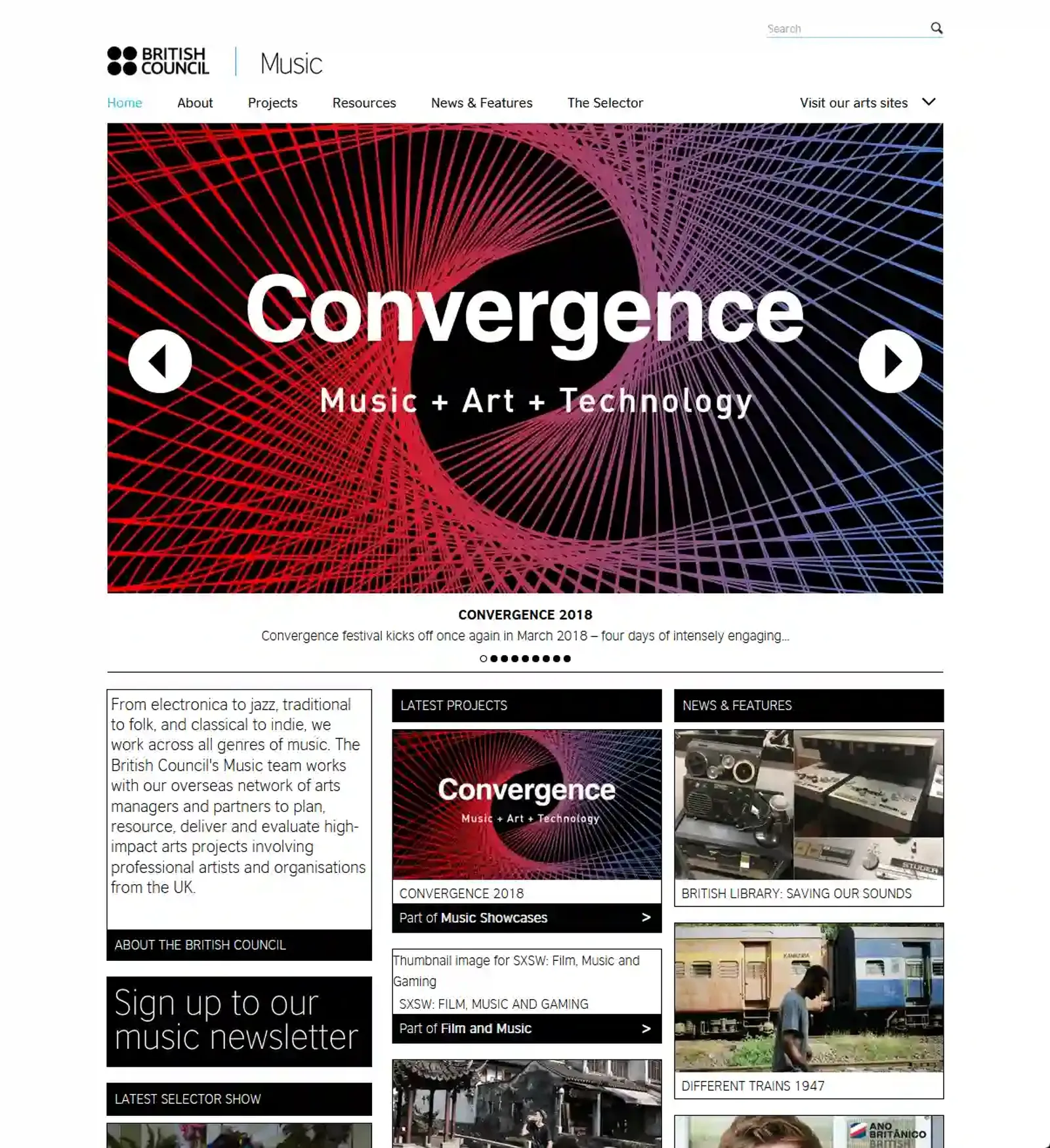
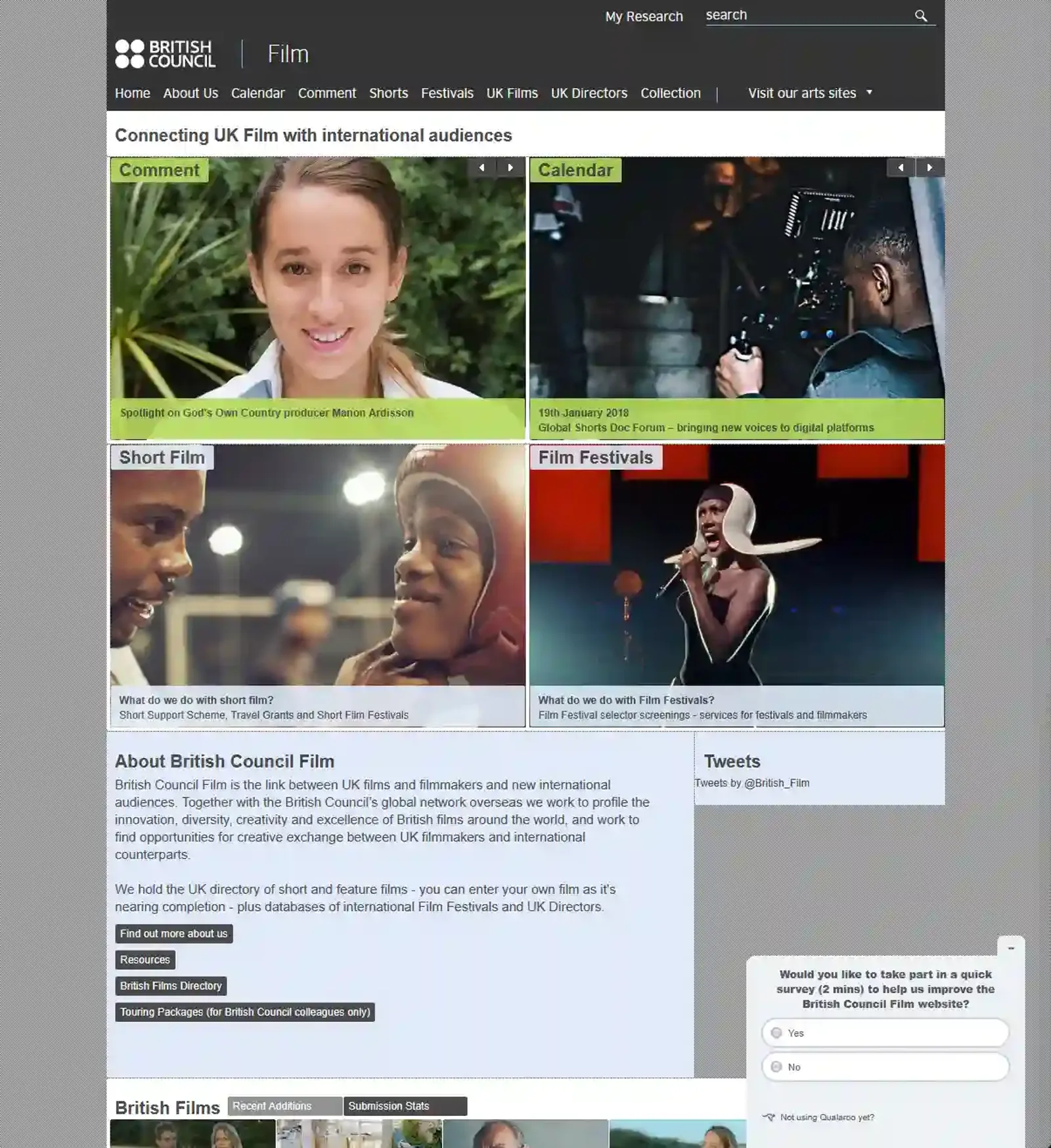
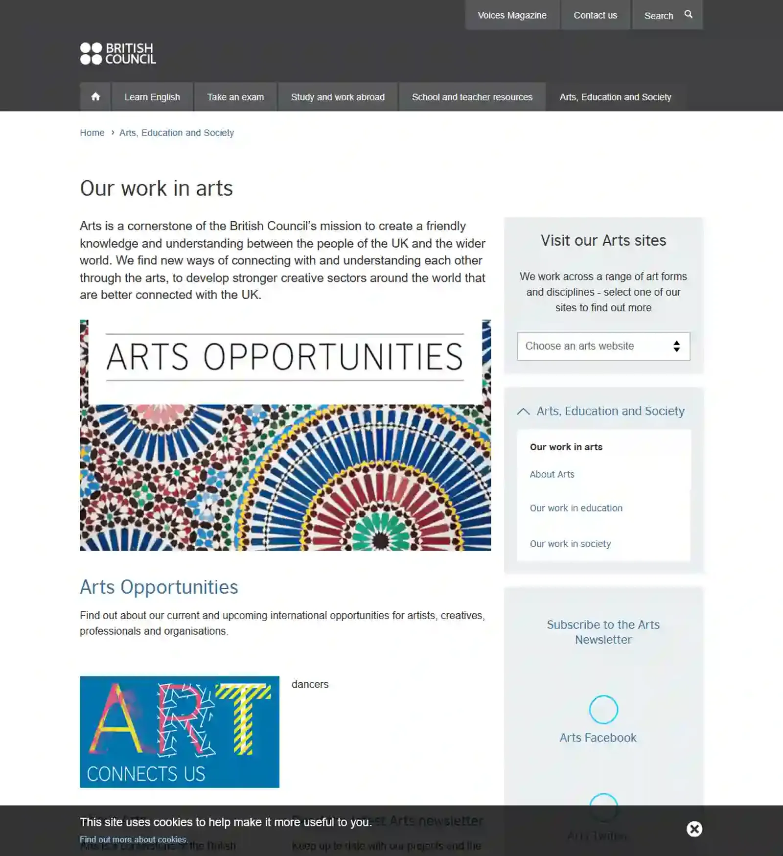
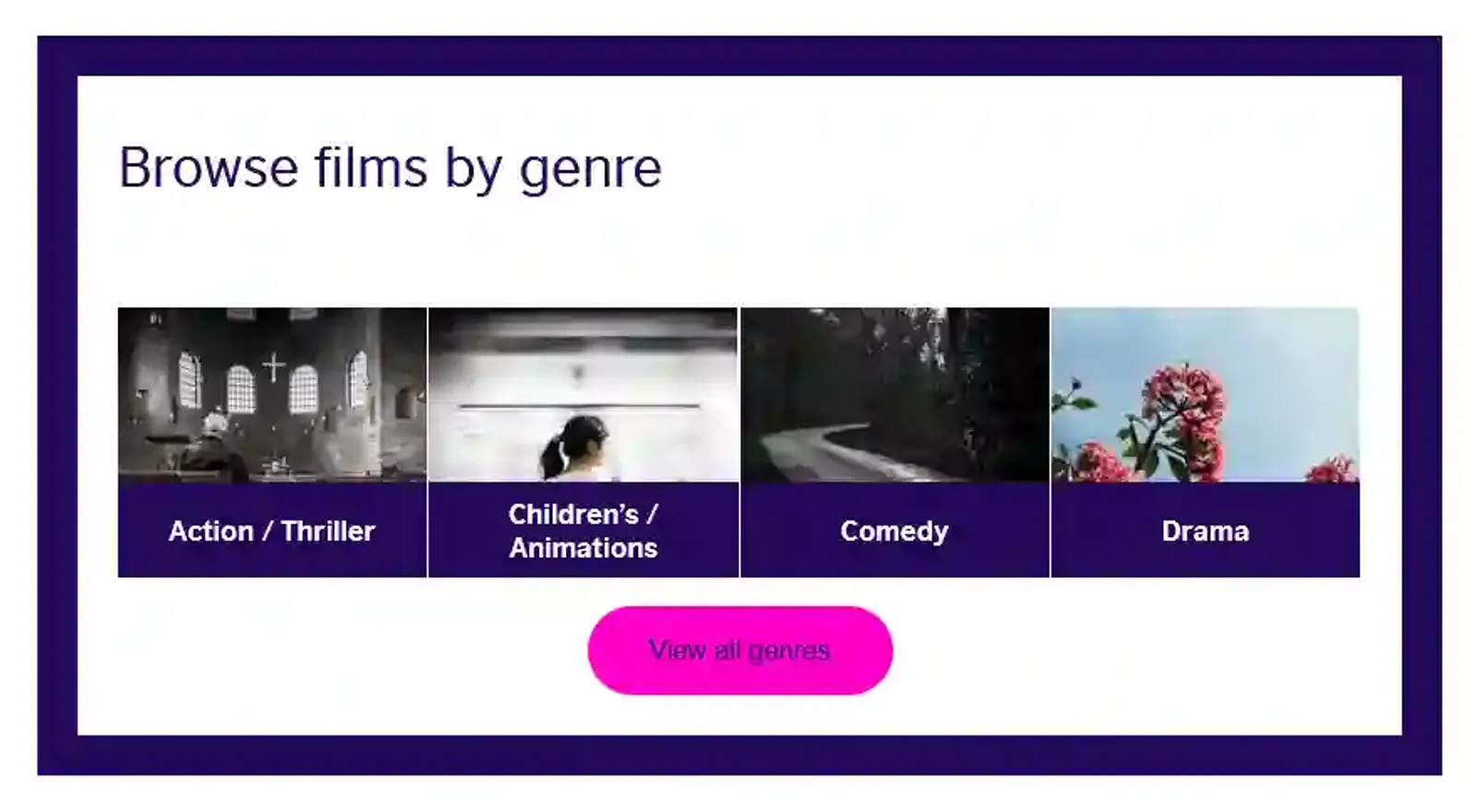
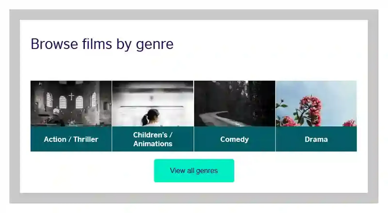
The British Council already had an impressive digital footprint in 2019, with dedicated domains for Music, Arts & Film. However, they all each bore the all too common sign of having been worked on at different times, by different people, following different sets of design guidelines. To unfamiliar visitors, it wasn't nearly clear enough that each of these services was provided by the same organisation.
Beyond the visual inconsistencies, this fragmentation also caused significant issues for the teams maintaining each of these sites. Teams were rebuilding the same interaction patterns over and over; content editors had to learn a different system for each brand. The digital estate had hit a ceiling.
The brief
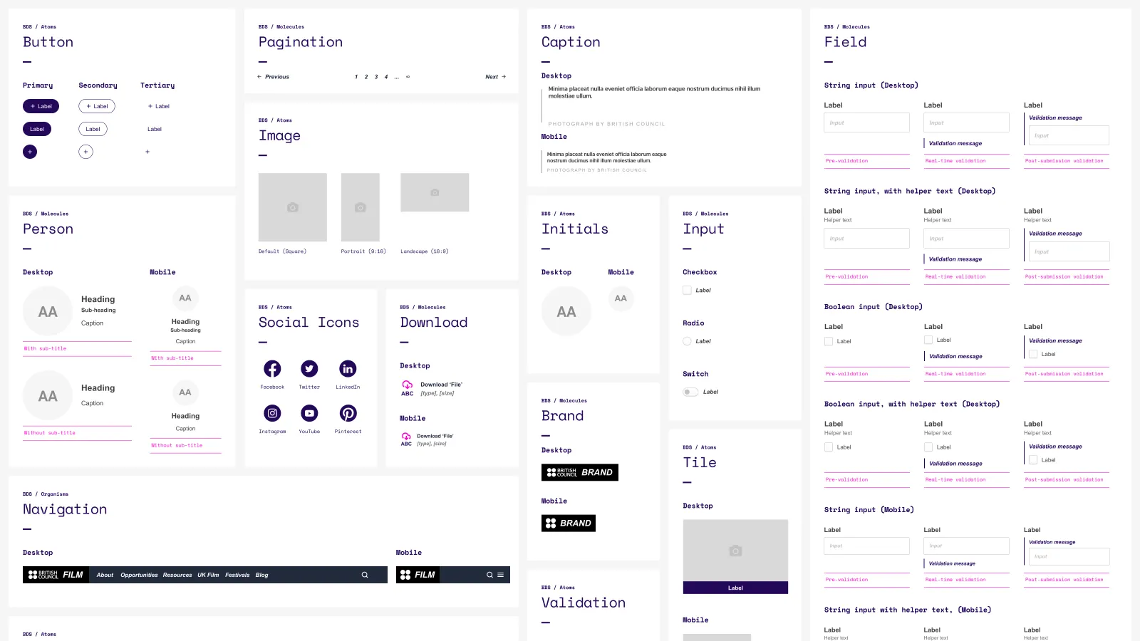
The proposed solution was a new design system, codenamed Brontë - not to make each property appear identical and rob them of their individual brand - but to provide a shared foundation via a library of reusable, themable components.
These would be authored in design files but also built as React.js components. Designers & developers would have a shared vocabulary to work from, content editors would be able to spin up pages faster without designer intervention, and visitors would finally feel like they were part of a wider ecosystem.
The right tool for the right job
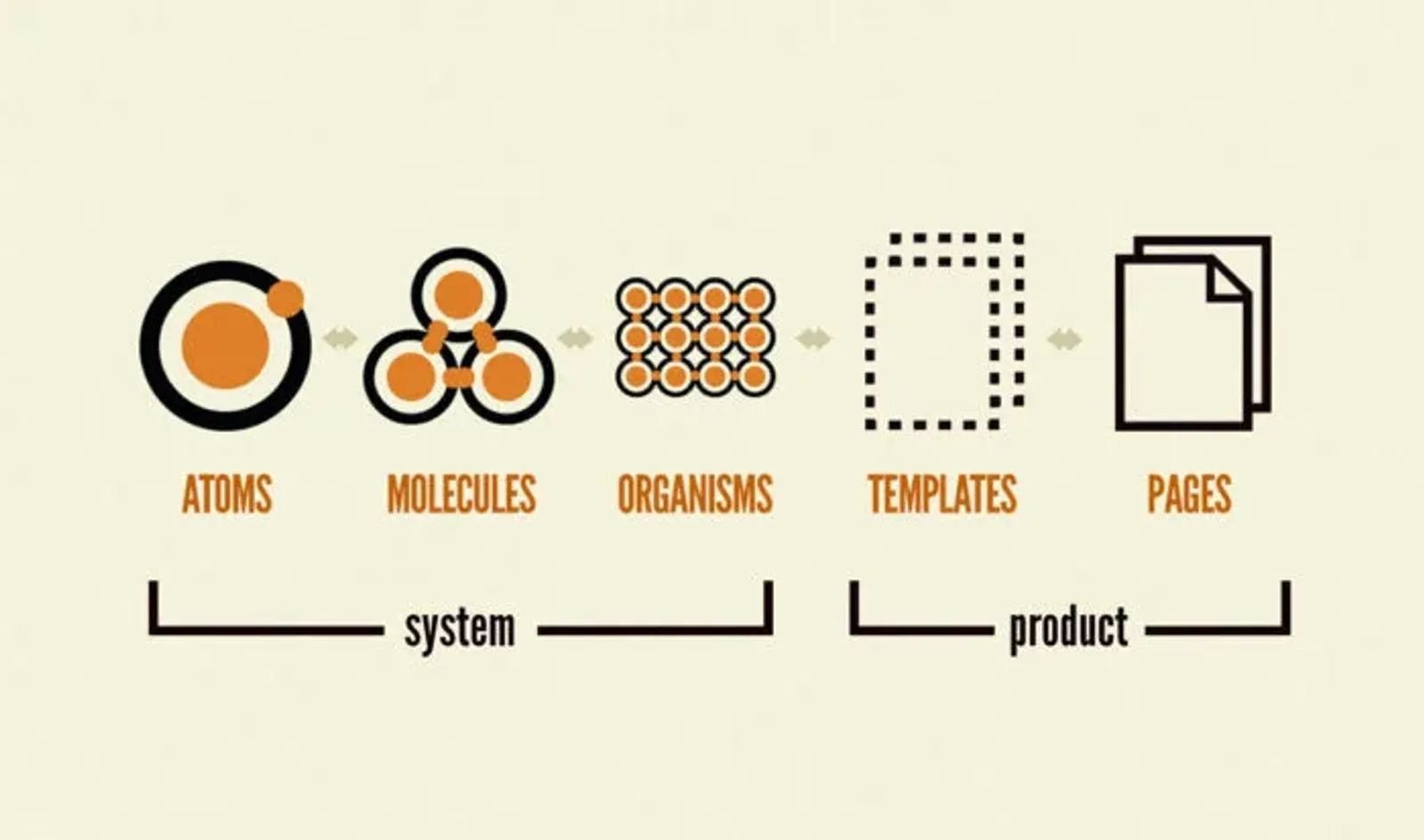
Brad Frost's 'Atomic Design' was a huge inspiration in shaping Brontë, establishing a framework where smaller, highly-specific 'atomic' components become constituent parts of larger 'molecules' & 'organisms', ensuring maximum reusability. Unfortunately, the design software the team had been using up until that point was quite lacking in its ability to accurately define components and nest them within one another. It also didn't allow our team to collaborate on the same file(s) in real time, which was crucial for moving at pace.
I'd recently started using Figma on some personal projects and believed that the project's success or failure could hinge on this fundamental tooling choice. After making a case directly to BC's Head of Digital promising drastically improved collaboration & flexibility, we were able to migrate our existing 'work in progress' files and onboard all members in the team in less than two weeks. Such was its pronounced effect on our project that it came to be adopted as the go-to design tool across the business.
The theming challenge
One of the trickier problems was around brand identity. The British Council isn't one monolithic brand — it's a family of interconnected services. We didn't want to completely strip away the creative flourishes of BC Film and BC Arts, but we also couldn't let teams customise everything however they wanted — that's how we'd ended up with the patchwork in the first place.
The solution was a theming system that gave teams freedom within guardrails. Certain things - like component intent, spacing etc. — remained defined, while brand flourishes such as accent colours - remained customisable by each team. For example, a brand could say "our primary colour is blue," but Brontë ultimately decided where that blue got used. It stopped well-intentioned but ultimately messy decisions from fragmenting the system again.
Putting it to the test
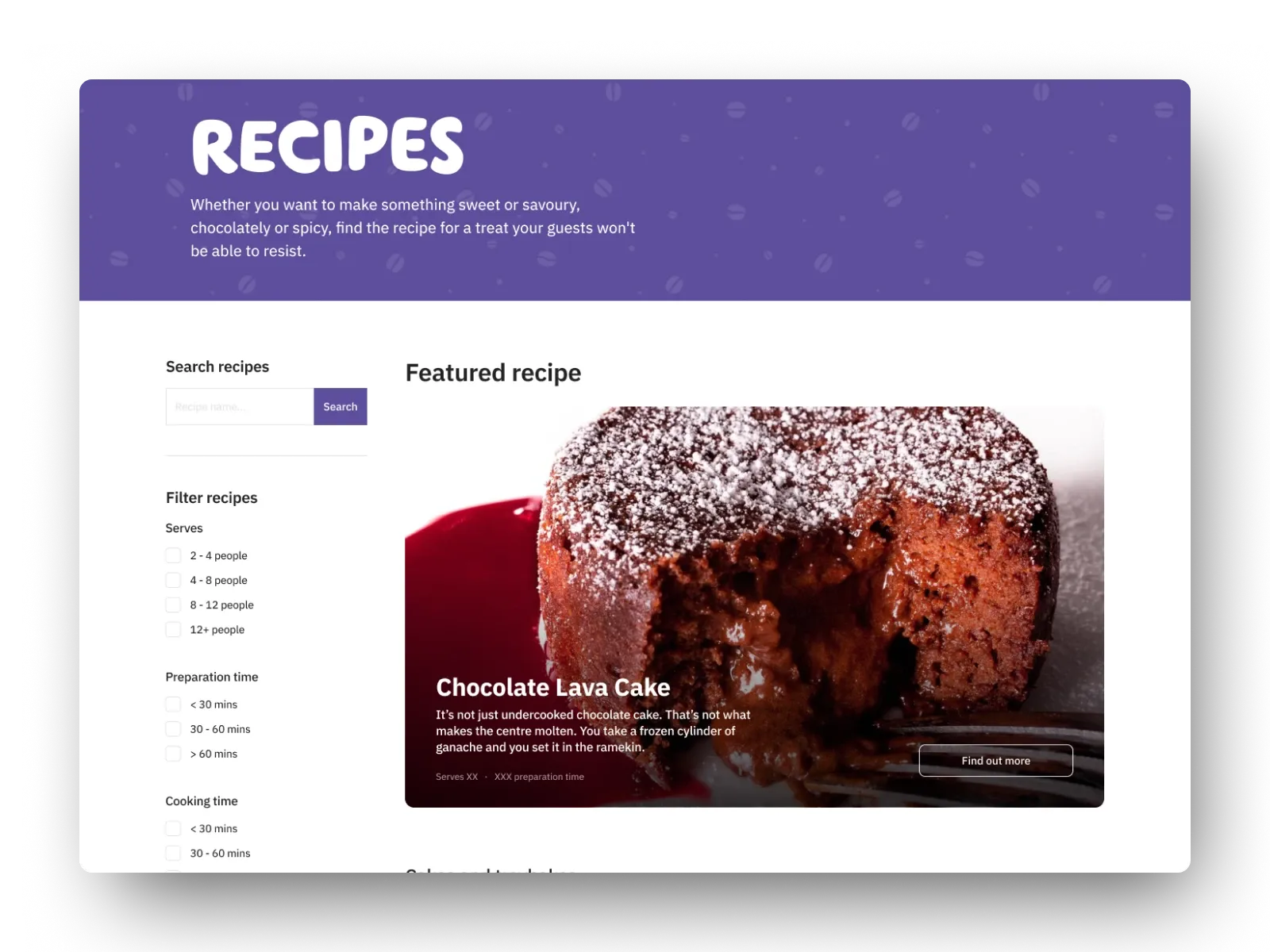
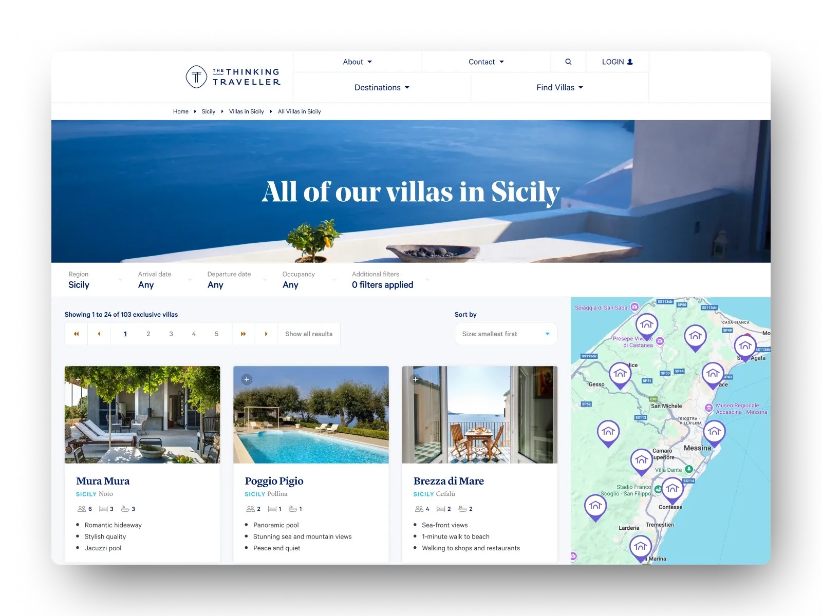
Naturally, part of the acceptance criteria for the project was obviously the system against one of the properties we were trying to improve. The system looked great on paper, but it was just a means to an end; the real test was seeing whether it worked on an actual site. We tested continuously throughout the development lifecycle, working with partners in BC Arts and BC Film to map existing functionality to new components we'd created with their input.
Working with these teams occasionally entailed requests that had to be carefully navigated in order to protect the long-term integrity of the system. With the ambition being for as much of the digital estate being powered by Brontë as possible, stakeholder appeals for highly specific patterns or customisation abilities outside the theming layer had to be diplomatically turned so that Brontë's focus could remain on features with the broadest usage potential.
The feedback we received from testing was overwhelmingly positive. Editors found it significantly easier & more intuitive to build out pages, while visitors reported that the site looked more modern & performed significantly faster. This was a major milestone in Brontë's development, having proved that the system could accommodate the needs of a real product.
What we delivered
By the end of my 12-month engagement, the Brontë library had amassed just over 30 components - including essential 'atoms' such as buttons and input fields as well as fully fledged 'organisms' such as navigation menus and footers - all fully themable & documented. The page-level components (i.e. Hero, Article etc.) were integrated with Contentful, allowing editors to assemble pages without the help of a designer/developer - the workflow we'd envisioned at the start of the process.