Building a premium e-commerce platform and design system for luxury bedding.
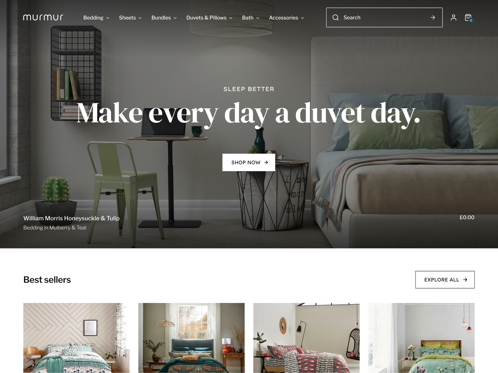
When Bedeck of Belfast launched their new luxury line Murmur, I set out to craft an immersive e-commerce experience as refined and inviting as the linens themselves.
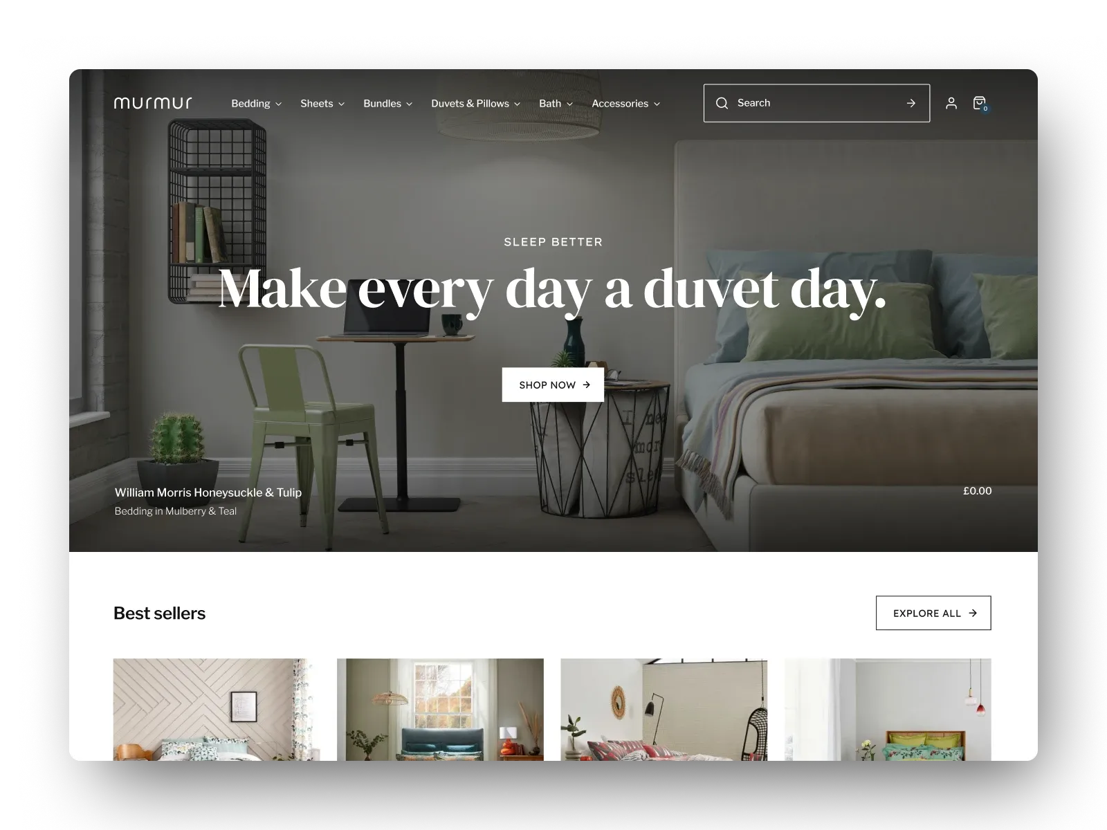
Tasked with showcasing both standalone pieces and curated bundles, I designed a chic, intuitive storefront reflecting the brand's unique sense of discreet and approachable opulence.
The result - a seamless blend of refined visuals and intuitive navigation, establishing a welcoming digital home for Murmur's discerning clientele.
A quiet kind of luxury.
Rather than compete with the immaculate composition of Murmur's product photography, the site's visual language was deliberately intended to get out of the way and allow the products themselves to shine.
The site embraces a minimalist aesthetic with generous whitespace, subdued colour palette and a simple yet intuitive layout which gently nudges visitors towards the product category they seek without coming across as too aggressive, or overbearing.
More ways to make a bed.
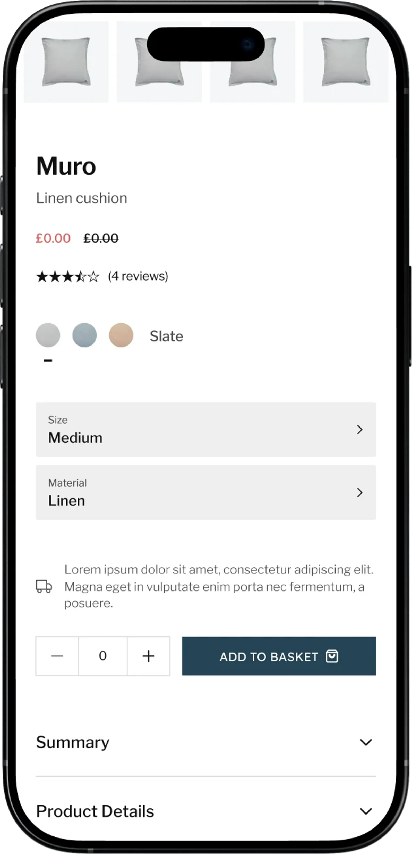
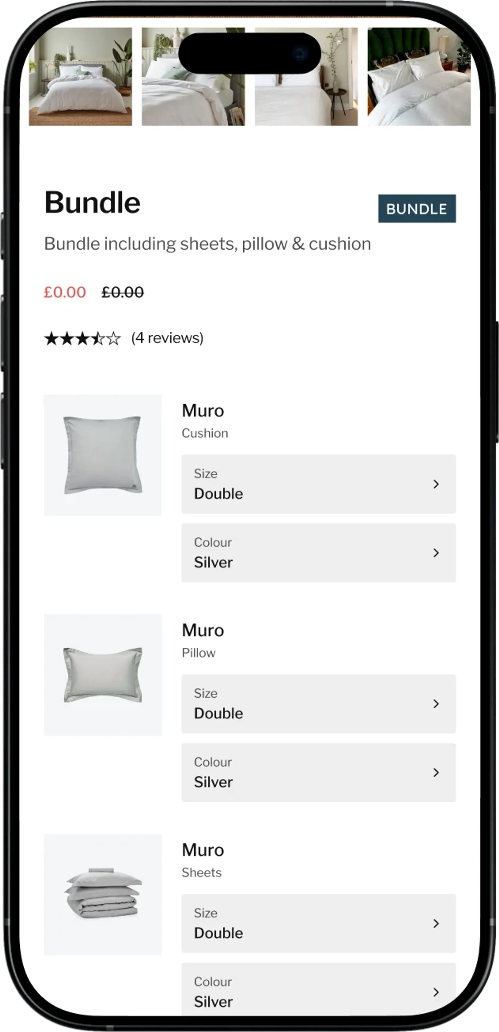
One of the most pivotal design challenges to overcome lay in the definition and presentation of complex product categories such as Bundles, a curated offering of certain product categories (such as a set of sheets, cushion and a pillow) offered at a fixed price or discounted compared to purchasing each individually.
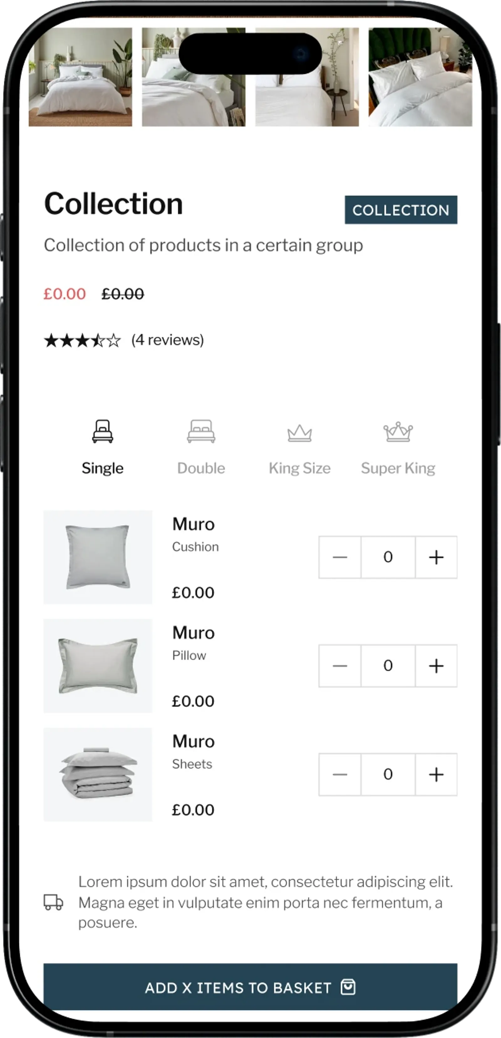
Collections, on the other hand, are more editorial groupings of products sharing a certain designer or theme, but surfaced directly on the product detail page to encourage deeper discovery of other products in that range.
A closer look, by design
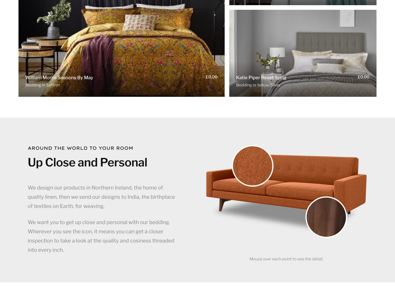
Murmur's products speak volumes in texture and detail, so we gave customers a way to get closer by introducing an interactive 'inspect' block on the homepage; a hover-to-zoom feature that reveals the finer qualities of a high-resolution image such as the weave of linen, or the stitching on a cushion.
The feature served as a subtle yet interactive tactile hook to quietly extol the craftsmanship of Murmur's product line while naturally being built to be flexibly & conveniently updated with images from updated seasonal lines.
The beauty in the building blocks
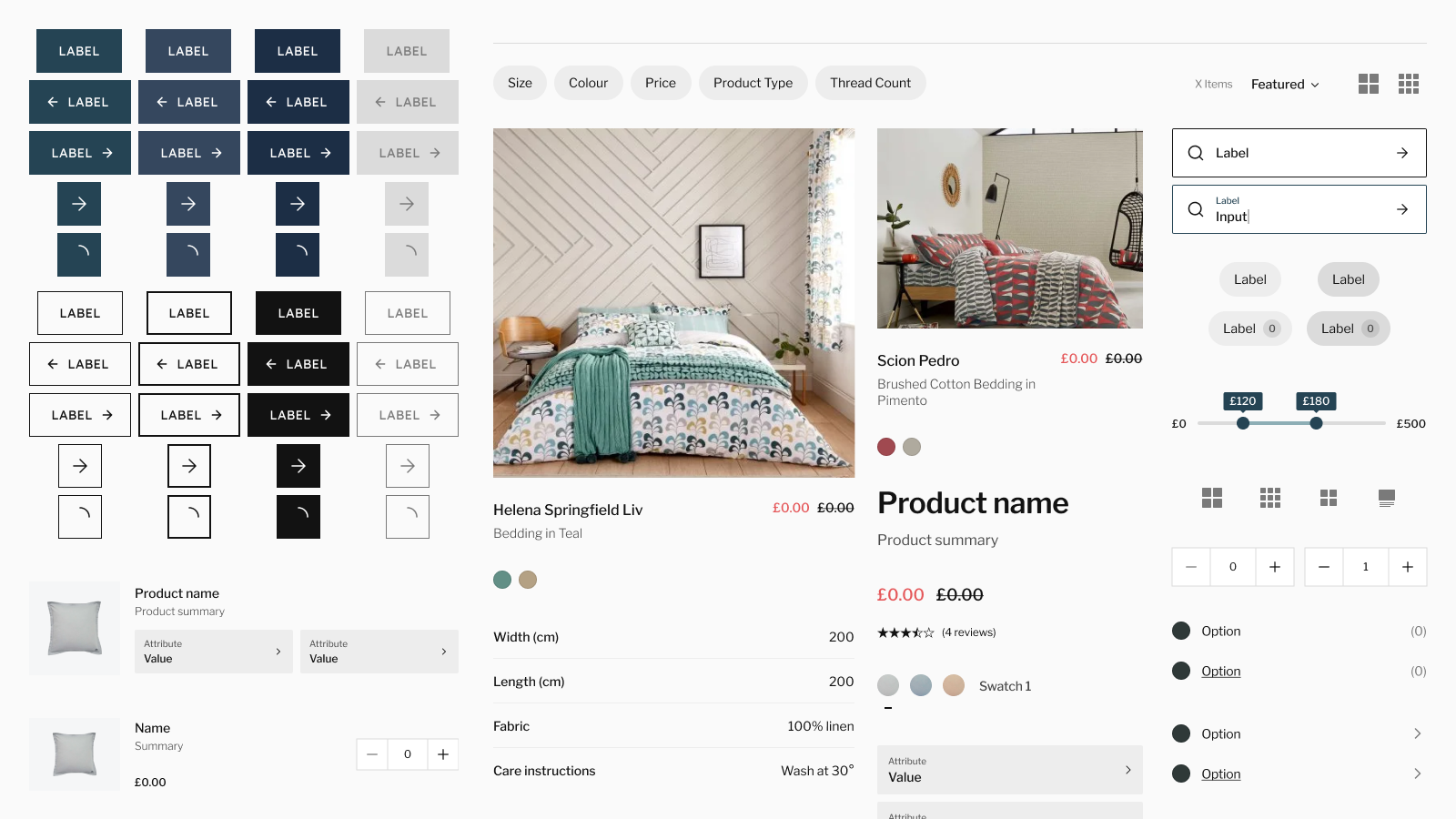
As the experience began to expand across a multitude of screens and product types, it became clear that a flexible foundation was required to keep everything feeling cohesive. Enter a lightweight design system: reusable components for elements such as buttons, product info layouts and interactive form elements.
This approach allowed for testing & refining details both in isolation and their relevant contexts, enuring that the overall experience remains polished & consistent.
